From product to platform, creating a companion app for a humidifier
The Overview
I redesigned a remote control app for a humidifier with a confusing physical interface. In doing so, the app improves usability by providing clear controls, smart scheduling as well as a comprehensive product info page, while adhering to the brand’s visual identity.
*This is an independent project not affiliated with Canopy
Project type
IoT Mobile App Design, Visual Branding
Timeline
January- April 2025
Tools
Illustrator, After Effects, Figma
The Problem
I purchased a highly rated Canopy humidifier that lacked intuitive controls; unlike competitor models this humidifier does not have app functionality, leading to a user experience that felt disconnected from the modern smart home ecosystem, in addition to 5% of reviews related to usability issues.
The Solution
I took this as an opportunity to reimagine the product’s digital experience by designing a remote control app aligned with the Canopy's brand identity, focusing on intuitive design and a more optimized user experience and cutting negative complaints by 5%!
Research and Insights
Pain point discovery
Upon using the humidifier for the first time, I took note of pain points that I initially noticed:
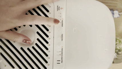
Hard to see controls
Limited functionality
No indication for some control levels
Examples of user complaints and pain points:


User Interviews
In order to gain more perspective on the pain points and how these features could be improved, I conducted a brief test to see what other users noticed, following these tasks:
Step 1

Turn on the device
Step 2

Set to highest fan speed
Step 3

Set to medium volume
These were the specific pain points I was able to note from user testing:
User 1:
22 y/o
Buttons are too small:
Long nails it made it difficult to press buttons on the panel with accuracy.
Confusing UI:
Repeated button system not intuitive, most confused with step 2.
User 2:
56 y/o
No indicators for volume:
Difficult setting up step 3, as there were no way to tell what volume levels there were.
Hard to see:
Poor contrast to background and small print size made it difficult to see.
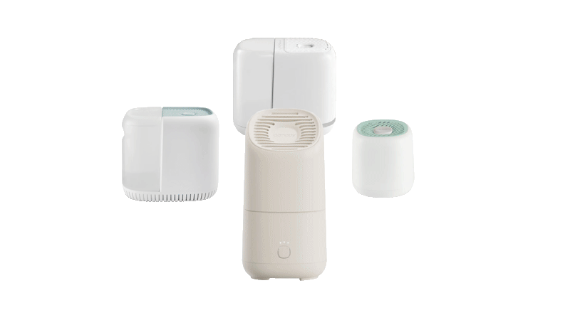
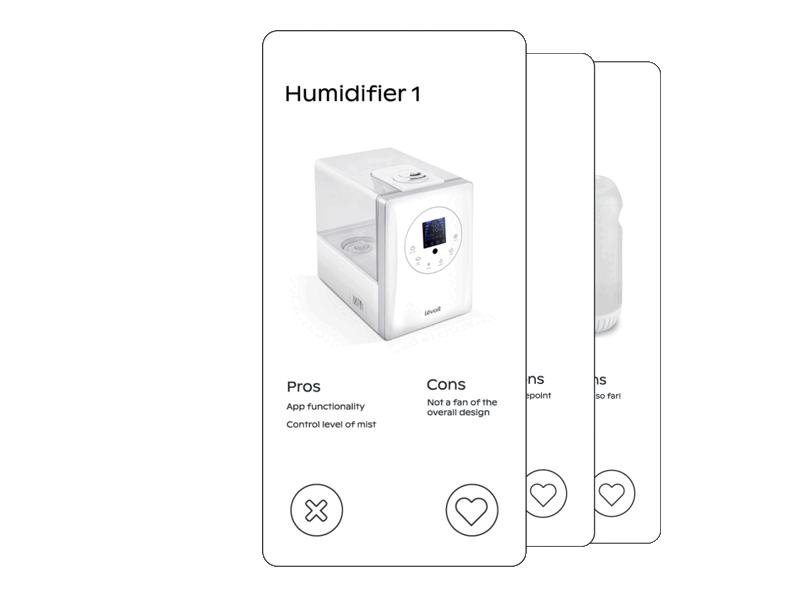
Competitor Analysis
To gain a better understanding of the current trends within device control apps, specifically pertaining to humidifiers, I took note of the recurring features in popular apps within the market.
Main controls screen
Create schedule
Schedules screen
Dyson - Humidifier Purifier


Levoit Humidifier


Goals for the design
Based on both user and market research, I found 3 areas I wanted to focus on in the app:
Simplify user interaction with intuitive controls
Provide smart scheduling features
Align visually with Canopy's existing brand identity
Information Architecture
Created a rough outline based on three main screens:

Design Systems
Logo

Color Palette

#ffffff
#f7f6f2
#f08269
#b5dfd8
#050608
Form Fields

Buttons


Typography


Primary

Secondary
Tertiary
Dropdowns

Iterations


Key visual changes
The initial design's color scheme did not align with the visual branding language of Canopy, thus needed a major revision.

Simplifying actions
By removing the toggle for 'Add Action', we eliminated an unnecessary step and more space, getting rid of scrolling and bigger controls.
